
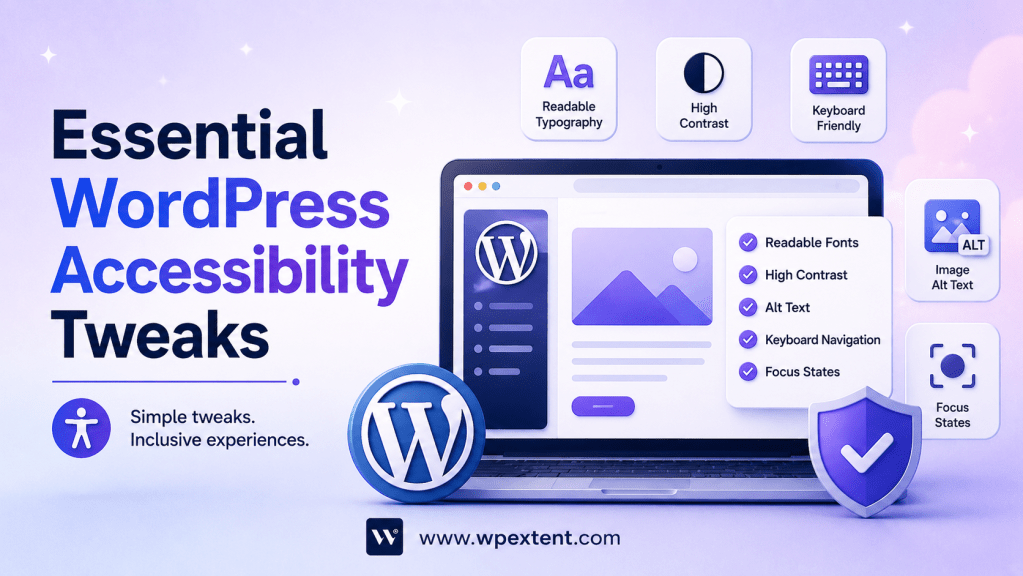
Why WordPress Accessibility Matters More Than Ever
Web accessibility has evolved from a “nice-to-have” feature into a business necessity. Yet over 96% of websites fail basic accessibility standards. If WordPress accessibility isn’t implemented on your website, you’re not just excluding people with disabilities—you’re losing customers, facing legal risks, and missing out on SEO benefits.
Here’s the reality: 1.3 billion people globally live with disabilities that impact their ability to use websites. That’s approximately 16% of the world’s population. In the United States alone, the ADA (Americans with Disabilities Act) is increasingly being enforced for digital properties. Organizations have paid millions in legal settlements for inaccessible websites.
But beyond compliance, accessibility creates better user experiences for everyone. Captions benefit people in noisy environments. Keyboard navigation helps those with mobility limitations—but also anyone who prefers keyboard shortcuts. Dark mode options serve people with visual sensitivities and battery-conscious mobile users alike.
WordPress powers over 43% of all websites. This massive market share means accessibility issues on WordPress sites affect millions of users worldwide. The good news? WordPress is inherently flexible enough to achieve excellent accessibility when properly configured.
Key Benefits of Accessible WordPress Sites:
- Reach 16% of the global population currently excluded from inaccessible sites
- Improve SEO rankings (Google favors accessible, well-structured content)
- Reduce legal liability and avoid costly ADA violations
- Enhance user experience for all visitors, not just those with disabilities
- Increase conversion rates through better usability
- Future-proof your site as accessibility requirements continue to evolve
2. Understanding (WCAG 2.1) Web Accessibility Standards
Before implementing accessibility tweaks, you need to understand what you’re working toward. The Web Content Accessibility Guidelines (WCAG) are the global standard for web accessibility, maintained by the W3C (World Wide Web Consortium).
WCAG 2.1 Levels Explained
WCAG operates on three conformance levels:
Level A – The foundational level covering basic accessibility. Think of this as “minimum acceptable” for public websites.
Level AA – The most commonly required level, recommended for all public websites. This is what the ADA typically expects and what you should target.
Level AAA – The highest level, often required only for government sites or organizations with strong accessibility commitments.
The Four Pillars of WCAG
Every accessibility principle falls into these four categories:
- Perceivable – Users must be able to perceive content. This includes providing text alternatives for images, captions for videos, and sufficient color contrast.
- Operable – Users must be able to navigate and interact with your site. This includes keyboard accessibility, sufficient time to read content, and avoiding content that triggers seizures.
- Understandable – Users must comprehend the content and how to operate the interface. This means clear language, predictable navigation, and helpful error messages.
- Robust – Content must work with assistive technologies like screen readers and speech recognition software.
Understanding these pillars helps you prioritize accessibility improvements. You don’t need to be perfect in all areas immediately—focus on Level AA compliance first, then expand from there.
3. Essential Accessibility Tweaks to Implement Today
Not all accessibility issues are created equal. Some tweaks take minutes but have enormous impact. Let’s start with the high-impact, quick-win improvements.
3.1 Fix Your Heading Structure (This One Is Critical)
Improper heading hierarchy is one of the most common WordPress accessibility mistakes. Screen reader users rely on headings to navigate content, similar to how sighted users scan for a table of contents.
The Rule: Start with H1 (your page title), then move to H2s for major sections. Only use H3s under H2s. Never skip heading levels (going from H1 directly to H3 creates confusion).
How to Fix It:
- Open any post/page in WordPress editor
- Check that your main title is marked as Heading 1
- All major section headings are Heading 2
- Subsections are Heading 3
- Never use headings for formatting (use bold or CSS instead)
Common Mistake: Many WordPress themes automatically insert H1 tags for headers while your post title also uses H1. This creates duplicate H1s. Use the WordPress SEO plugin settings to ensure only one H1 per page.
CORRECT STRUCTURE:H1: Main Page Title H2: Section One H3: Subsection 1A H3: Subsection 1B H2: Section Two H3: Subsection 2A
3.2 Implement Proper Skip Links
Skip links are invisible links that appear when you press Tab on a keyboard. They let users jump directly to main content, bypassing repetitive navigation.
Most modern WordPress themes include skip links, but they’re often broken or poorly implemented. Test yours by:
- Visit your site
- Press Tab once
- You should see a “Skip to main content” link appear
If it doesn’t appear, add this code to your WordPress theme’s functions.php:
php
function add_skip_link() { echo '<a href="#main-content" class="skip-link">Skip to main content</a>';}add_action( 'wp_body_open', 'add_skip_link' );
Then add this CSS to your theme:
css
.skip-link { position: absolute; top: -40px; left: 0; background: #000; color: white; padding: 8px; text-decoration: none; z-index: 100;}.skip-link:focus { top: 0;}
3.3 Add ARIA Labels to Custom Buttons and Icons
ARIA (Accessible Rich Internet Applications) labels are invisible text that screen readers use to understand elements that don’t have natural text content.
Where You Need ARIA Labels:
- Icon-only buttons (hamburger menus, search buttons, close buttons)
- Custom controls and widgets
- Navigation menus created with custom code
Example – Icon Button Without Label:
html
<!-- INACCESSIBLE --><button><i class="icon-search"></i></button><!-- ACCESSIBLE --><button aria-label="Search"> <i class="icon-search"></i></button>
Example – Navigation Toggle:
html
<!-- Good practice for mobile menus --><button aria-label="Toggle navigation menu" aria-expanded="false" aria-controls="main-menu"> <span></span></button>
The aria-expanded attribute tells screen readers whether the menu is open or closed. Update this dynamically when the menu opens/closes.
3.4 Ensure Keyboard Navigation Works Completely
A significant portion of assistive technology users rely entirely on keyboard navigation. If your site isn’t fully usable with just a keyboard, it’s inaccessible.
Test Your Site’s Keyboard Accessibility:
- Unplug your mouse or trackpad
- Use only the Tab key to navigate
- Press Enter/Space to activate buttons and links
- Can you access all interactive elements?
- Is there visible focus styling on every interactive element?
Common Issues:
Missing Focus Indicators – Interactive elements should show a visible outline or change when focused. Many modern designs remove the default focus ring with outline: none without replacement. This breaks keyboard navigation.
Fix it:
css
a:focus, button:focus, input:focus { outline: 2px solid #4A90E2; outline-offset: 2px;}
Keyboard Traps – Users get stuck in a section and can’t Tab out. This often happens with modals or custom menus.
Test: Can you Tab through the element and then continue to the next element on the page?
Inaccessible Dropdowns – Dropdown menus that only work with a mouse. Fix these with proper keyboard handlers:
javascript
document.querySelectorAll('.menu-item-has-children > a').forEach(link => { link.addEventListener('keydown', (e) => { if (e.key === 'Enter') { e.preventDefault(); link.nextElementSibling.classList.toggle('open'); } });});
4. WordPress Plugins That Transform Accessibility
Several excellent plugins can automate accessibility improvements. However, plugins are not a substitute for proper design—they supplement good practices.
4.1 WP Accessibility
What It Does: Adds missing heading structure, improves link labeling, and enforces WCAG standards.
Key Features:
- Automatically improves heading hierarchy
- Removes empty headings that cause confusion
- Enhances search form accessibility
- Adds skip links
- Improves blockquote and list accessibility
Cost: Free
Best For: Sites with poor heading structure or fundamental accessibility issues
4.2 Accessibility Checker
What It Does: Scans your entire website and identifies accessibility violations in real-time.
Key Features:
- Automatic daily scans of all pages
- Detailed reports showing exactly what’s broken
- Integration with WCAG 2.1 standards
- Admin dashboard with priority recommendations
- Free version includes essential features
Cost: Free (Pro version available)
Best For: Ongoing monitoring and identifying problems quickly
4.3 WP Accessibility Pro
What It Does: Advanced accessibility enhancements including ReadSpeaker integration (text-to-speech), dark mode, and dyslexia-friendly fonts.
Key Features:
- Built-in text-to-speech functionality
- Adjustable font sizes and styles
- Color inversion and high contrast options
- Dark mode toggle
- Dyslexia-friendly font option
- Text spacing adjustments
Cost: Paid plugin ($99-299/year typically)
Best For: Sites wanting comprehensive accessibility features with user controls
4.4 Alt Text Generator
What It Does: Automatically generates meaningful alt text for images using AI.
Key Features:
- Batch processes existing images
- AI-powered descriptions
- Manual override options
- Supports multiple image types
Cost: Free with paid premium features
Best For: Large image libraries or frequent image uploads
5. Keyboard Navigation: The Overlooked Critical Feature
Keyboard navigation is arguably the single most important accessibility feature you can implement. Here’s why:
- 4.3% of website users are keyboard-only (either from disability or preference)
- Many screen reader users navigate primarily with keyboard commands
- Mobile users benefit from keyboard alternatives
- Keyboard accessibility often fixes problems for other assistive technologies
5.1 Implementing Complete Keyboard Navigation
Tab Order: Elements must be navigable in a logical sequence. By default, WordPress follows the HTML source order. If your CSS reorders elements visually (with flexbox or grid), the Tab order becomes confusing.
Fix it with the tabindex attribute, but be careful:
- Use
tabindex="0"for custom interactive elements that should be reachable via Tab - Avoid positive tabindex values (they override natural tab order)
- Never use
tabindex="1"or higher—it creates an illogical navigation order
html
<!-- Custom element that needs to be focusable --><div class="custom-control" tabindex="0"> Interact with me using keyboard</div>
Handling Dropdowns and Menus:
javascript
// When opening a dropdown, focus the first menu itemconst menuButton = document.querySelector('.menu-toggle');const menu = document.querySelector('.menu');const menuItems = menu.querySelectorAll('a, button');menuButton.addEventListener('click', () => { menu.classList.add('open'); menuItems[0].focus(); // Focus first menu item});// Trap focus within menumenuItems.forEach((item, index) => { item.addEventListener('keydown', (e) => { if (e.key === 'ArrowDown') { e.preventDefault(); menuItems[(index + 1) % menuItems.length].focus(); } if (e.key === 'ArrowUp') { e.preventDefault(); menuItems[(index - 1 + menuItems.length) % menuItems.length].focus(); } if (e.key === 'Escape') { menuButton.focus(); menu.classList.remove('open'); } });});
5.2 Focus Visible vs Focus
Modern browsers distinguish between keyboard focus (:focus-visible) and mouse focus. This lets you show indicators only for keyboard users:
css
/* Show indicator only for keyboard focus */button:focus-visible { outline: 3px solid #4A90E2; outline-offset: 2px;}/* Don't show outline for mouse clicks */button:focus:not(:focus-visible) { outline: none;}
This creates a better experience for mouse users while maintaining accessibility for keyboard users.
6. Color Contrast and Text Readability Guidelines
Color contrast is deceptively important. People with color blindness, low vision, or viewing on bright screens struggle with low-contrast text.
6.1 Understanding WCAG Contrast Ratios
WCAG defines contrast ratios:
- Level AA: 4.5:1 ratio for body text, 3:1 for large text
- Level AAA: 7:1 ratio for body text, 4.5:1 for large text
“Large text” means 18pt+ (or 14pt+ bold).
6.2 Testing Contrast
Use the WebAIM Contrast Checker (webaim.org/resources/contrastchecker) to test any color combination.
Common Problem Areas:
- Gray text on white background
- White text on light gray
- Placeholder text in form fields
- Hover states that only change color
- Links that only use color to distinguish them
Fix for Links:
css
a { color: #0066cc; text-decoration: underline; /* Don't rely on color alone */}a:hover { background-color: #ffffcc; /* Add visual change beyond color */}
6.3 Typography for Accessibility
Beyond contrast, typography itself impacts accessibility:
Font Size:
- Body text should be 16px minimum
- Avoid tiny text that forces users to zoom
- Ensure text scales on mobile
Line Height:
- Use 1.5x line height minimum for body text
- 1.5 improves readability for people with dyslexia
- Increases space between lines, reducing visual fatigue
Line Length:
- Keep lines to 50-75 characters maximum
- Longer lines are harder to scan
- Use CSS:
max-width: 70ch;
Font Choice:
- Sans-serif fonts are generally easier to read
- Avoid decorative fonts for body text
- Use system fonts or widely-supported web fonts
- Provide fallback fonts
css
body { font-family: -apple-system, BlinkMacSystemFont, 'Segoe UI', Roboto, 'Helvetica Neue', Arial, sans-serif; font-size: 16px; line-height: 1.6; max-width: 70ch; margin: 0 auto;}
7. Alternative Text for Images and Media
Alternative text (alt text) is the most fundamental accessibility feature. Alt text is read aloud by screen readers and displayed when images fail to load.
7.1 Writing Effective Alt Text
The Goal: Describe what the image conveys, not just what it shows.
Bad Alt Text Examples:
- “Image” (tells nothing)
- “Smiley face” (describes object, not purpose)
- “Graph of Q3 sales” (no context)
Better Alt Text Examples:
- “Sales increased 23% in Q3 compared to Q2”
- “Sarah speaking at the 2024 WordPress conference”
- “Flowchart showing the customer journey from discovery to purchase”
Guidelines:
- Be specific and descriptive (usually 125 characters max)
- Include relevant context
- For decorative images, use empty alt text:
alt="" - For complex images (charts, graphs), provide longer descriptions
- Never start with “Image of” or “Picture of” (screen readers already announce it’s an image)
7.2 Adding Alt Text in WordPress
Method 1: Classic Approach
- Click the image in the editor
- Click “Edit” or the pencil icon
- Enter description in “Alternative Text” field
Method 2: Block Editor
- Select the Image block
- Open Settings panel (right sidebar)
- Scroll to “Alt Text” under Advanced
- Enter your description
Batch Update Alt Text: Use the Bulk Image Alt Text plugin to add missing alt text to existing images in bulk, then manually review and refine.
7.3 Accessible Video and Audio
Videos:
- Always include captions (not just for deaf users—they help in noisy environments)
- Provide transcripts
- Use accessible video players that support keyboard controls
WordPress Video Shortcode:
Better: Use a video plugin like Fitvids or YouTube’s built-in embed:
Audio:
- Provide transcripts for podcasts
- Consider captions even for audio content
8. Accessible Forms: A Step-by-Step Implementation Guide
Forms are critical for conversion, but poorly structured forms block many users. Here’s how to build accessible forms.
8.1 Form Label Association
Every form input must have an associated label. Users navigating by keyboard or screen reader need to know what each field is for.
Bad Form:
html
<input type="text" placeholder="Enter your email"><input type="password" placeholder="Enter your password">
Good Form:
html
<label for="email">Email Address</label><input type="email" id="email" required><label for="password">Password</label><input type="password" id="password" required>
The for attribute must match the input’s id. This creates a relationship that assistive technology can understand.
8.2 Form Field Validation and Error Messages
When validation errors occur, clearly indicate what’s wrong:
html
<label for="phone">Phone Number</label><input type="tel" id="phone" aria-describedby="phone-error" aria-invalid="true"><span id="phone-error" role="alert"> Phone number must be 10 digits</span>
Key elements:
aria-describedbylinks the input to error textaria-invalid="true"marks the field as invalidrole="alert"announces errors to screen readers
8.3 Grouping Related Fields
For complex forms, group related fields:
html
<fieldset> <legend>Billing Address</legend> <label for="street">Street Address</label> <input type="text" id="street"> <label for="city">City</label> <input type="text" id="city"> <label for="state">State</label> <input type="text" id="state"></fieldset>
The <fieldset> groups fields logically, and the <legend> describes the group. Screen readers announce these relationships, making complex forms manageable.
8.4 Making Checkboxes and Radio Buttons Accessible
html
<!-- Accessible checkbox --><input type="checkbox" id="subscribe" name="subscribe"><label for="subscribe">Subscribe to our newsletter</label><!-- Accessible radio buttons (grouped) --><fieldset> <legend>Newsletter Frequency</legend> <input type="radio" id="weekly" name="frequency" value="weekly"> <label for="weekly">Weekly</label> <input type="radio" id="monthly" name="frequency" value="monthly"> <label for="monthly">Monthly</label></fieldset>
8.5 Accessible Select Dropdowns
While HTML select elements are natively accessible, custom dropdowns often aren’t. If you must use custom dropdowns, test thoroughly with keyboard navigation.
If using plugins like WP Forms or Gravity Forms, enable their accessibility options:
- Check “Enable ARIA labels”
- Ensure form validation is clearly explained
- Test with Tab key navigation
9. Testing Your WordPress Site for Accessibility Issues
You can’t improve what you don’t measure. Regular testing should be part of your maintenance routine.
9.1 Automated Testing Tools
WebAIM Wave (wave.webaim.org)
- Browser extension for instant feedback
- Shows errors, warnings, and features on each page
- Color-coded visual overlay
- Perfect for quick checks during development
NVDA (Free Screen Reader)
- Download the free NVDA screen reader
- Experience your site as blind users do
- Most realistic testing method
- Steep learning curve but invaluable
Lighthouse (Built into Chrome)
- Open DevTools (F12)
- Click “Lighthouse”
- Select “Accessibility”
- Run audit
- Get detailed report with actionable fixes
AXE DevTools
- Browser extension by Deque Systems
- Highly accurate automated testing
- Integrates with Chrome DevTools
- Free and premium versions
9.2 Manual Testing Checklist
Beyond automated tools, manual testing catches things automation misses:
Navigation:
- Can you navigate the entire site with Tab key only?
- Is focus always visible?
- No keyboard traps?
- Tab order is logical?
Images:
- All images have alt text?
- Alt text is descriptive?
- Decorative images have empty alt text?
Content:
- Heading structure is correct (H1 → H2 → H3)?
- No skipped heading levels?
- Lists use proper list markup?
- Links are descriptive (not “click here”)?
Forms:
- All inputs have labels?
- Error messages are clear?
- Can you complete the form with keyboard only?
Videos:
- Captions provided?
- Transcript available?
Color:
- Sufficient contrast (test with WebAIM)?
- Color not the only way to convey information?
9.3 Creating a Testing Schedule
Don’t just test once. Make it routine:
- Weekly: Quick automated scan during development
- Monthly: Full manual testing of most-visited pages
- Quarterly: Comprehensive audit of entire site
- After Updates: Test before deploying WordPress or plugin updates
10. Accessibility and SEO: The Unexpected Connection
Here’s something many people don’t realize: accessibility improvements almost always improve SEO.
10.1 Why Google Favors Accessible Sites
Google’s algorithm increasingly rewards accessibility:
Proper Heading Structure
- Google uses headings to understand page content
- Proper H1 → H2 → H3 hierarchy helps Google categorize your content
- Improves rankings for your target keywords
Image Alt Text
- Google reads alt text to understand images
- Images with good alt text rank in Image Search
- Image traffic is often significant
Keyboard Navigation and Mobile
- Google’s mobile-first indexing prefers keyboard-accessible sites
- Better performance on mobile
- Mobile is 60%+ of searches
Captions and Transcripts
- Transcripts provide additional keyword-rich content
- Helps Google understand video content
- Increases time on page (positive ranking signal)
Page Speed
- Accessible sites often have cleaner code
- Minimal JavaScript and better performance
- Page speed is a ranking factor
10.2 Quick SEO Wins from Accessibility
Implement Proper Schema Markup While implementing accessibility, add schema.org markup. This helps Google understand:
- Article structure
- Author information
- Publication date
- Video content
- FAQs
html
<script type="application/ld+json">{ "@context": "https://schema.org", "@type": "BlogPosting", "headline": "Essential Accessibility Tweaks Every WordPress Site Needs Right Now", "image": "image.jpg", "datePublished": "2024-01-15", "author": { "@type": "Person", "name": "Sarah Johnson" }}</script>
Optimize Core Web Vitals Accessibility improvements often improve Core Web Vitals:
- Largest Contentful Paint (LCP)
- First Input Delay (FID)
- Cumulative Layout Shift (CLS)
These are ranking factors, and accessible design naturally improves them.
11. Common Accessibility Mistakes to Avoid
Learning what NOT to do is as important as learning best practices.
11.1 Using Color Alone to Convey Meaning
❌ WRONG:
html
<p>The required fields are marked in <span style="color: red;">red</span></p>
Colorblind users won’t know which fields are required.
✓ CORRECT:
html
<p>Required fields are marked with an asterisk (*)</p><label for="email">Email <span aria-label="required">*</span></label>
11.2 Removing Focus Indicators
❌ WRONG:
css
* { outline: none;}
This completely breaks keyboard navigation for sighted users.
✓ CORRECT:
css
*:focus-visible { outline: 2px solid #4A90E2; outline-offset: 2px;}
11.3 Inline Styling Instead of Semantic HTML
❌ WRONG:
html
<div style="font-weight: bold; font-size: 1.5em;">Important Notice</div>
Screen readers don’t understand visual styling without semantic meaning.
✓ CORRECT:
html
<strong>Important Notice</strong><!-- or --><h2>Important Notice</h2>
11.4 Auto-playing Audio or Video
❌ WRONG:
html
<audio autoplay> <source src="background-music.mp3"></audio>
This is jarring and blocks screen reader users from hearing content.
✓ CORRECT:
html
<audio controls> <source src="sound.mp3"> Your browser doesn't support audio. Download the <a href="sound.mp3">MP3</a>.</audio>
11.5 Relying on JavaScript for Essential Functionality
❌ WRONG: Content only appears with JavaScript. No fallback.
✓ CORRECT:
html
<!-- Works without JavaScript, enhanced with JavaScript --><details> <summary>More Information</summary> This content is available to all users, with or without JavaScript</details><script>// JavaScript enh ancement (optional)document.querySelectorAll('details').forEach(detail => { // Add smooth animation on toggle});</script>
11.6 Ignoring Mobile Accessibility
Mobile screens are smaller, making touch targets critical. Buttons must be at least 44×44 pixels.
✓ CORRECT:
css
button { min-width: 44px; min-height: 44px; padding: 12px 16px;}
11.7 Using Inaccessible Plugins Without Knowledge
Just because a WordPress plugin is popular doesn’t mean it’s accessible. Before installing:
- Check the plugin’s accessibility statement
- Test with WAVE before and after installation
- Review if it uses proper ARIA labels
- Ensure it doesn’t break keyboard navigation
12. Your Action Plan for Complete Accessibility
Achieving full accessibility isn’t a one-time task—it’s ongoing. Here’s your prioritized action plan:
Phase 1: Quick Wins (Week 1)
These take minimal time but have huge impact:
Day 1-2: Audit Your Headings
- Install WebAIM WAVE extension
- Check every page for heading structure
- Fix incorrect heading levels
- Ensure one H1 per page
Day 3-4: Add Alt Text
- Review all images
- Write descriptive alt text for non-decorative images
- Mark decorative images with empty alt:
alt="" - Use alt text generator plugin for mass images
Day 5: Fix Link Text
- Search for “click here” links (use Find function)
- Rewrite to be descriptive: “Read our accessibility guide” instead of “Click here”
- Ensure links are underlined or otherwise visually distinct
Day 6-7: Test Keyboard Navigation
- Unplug mouse
- Navigate entire site with Tab key
- Identify and fix any keyboard traps
- Ensure all interactive elements are reachable
Phase 2: Core Improvements (Weeks 2-3)
Form Accessibility
- Review all forms
- Add missing labels
- Improve error messaging with ARIA
- Test form completion with Tab key only
Color Contrast
- Test all text with WebAIM Contrast Checker
- Fix any ratios below 4.5:1 for normal text
- Fix any ratios below 3:1 for large text
Install Key Plugins
- Accessibility Checker (monitoring)
- Alt Text Generator (automation)
- WP Accessibility (enhancement)
Phase 3: Advanced Implementation (Weeks 4-6)
Video and Media
- Add captions to all videos
- Provide transcripts for audio
- Test video players for keyboard access
ARIA Implementation
- Add ARIA labels to icon buttons
- Add ARIA descriptions where needed
- Implement proper ARIA for custom widgets
Advanced Testing
- Download NVDA screen reader
- Test with actual screen reader
- Fix issues that automated tools missed
Phase 4: Ongoing Maintenance (Ongoing)
- Monthly: Run automated scan
- Quarterly: Complete manual audit
- Before every update: Test critical pages
- After each new feature: Accessibility check before launch
Measuring Your Progress
You can’t improve what you don’t measure. Track these metrics:
Automated Testing Score:
- Start: Run Lighthouse accessibility audit
- Target: 95+ score
- Frequency: Monthly
Manual Testing Checklist:
- Create a checklist of 20-30 items
- Score: How many do you pass?
- Target: 100%
- Frequency: Quarterly
User Feedback:
- Monitor support inquiries about accessibility
- Track complaint topics
- Use this to identify problem areas
Analytics:
- Monitor bounce rate (which segments bounce most?)
- Check session duration by device type
- Accessible sites often see improved metrics
Conclusion: Accessibility Is Not Optional
Accessibility is no longer optional. It’s a legal requirement in many jurisdictions, a moral imperative to serve all users, and increasingly a business necessity as search engines and users demand it.
The good news? You don’t need to overhaul your entire website overnight. Start with the quick wins in Phase 1. Most can be completed in a single week and will dramatically improve your site’s accessibility.
WordPress is powerful enough to achieve WCAG 2.1 AA compliance across your entire site. It just requires intentional choices—proper heading structure, accessible forms, keyboard navigation, and adequate color contrast.
Your website serves a purpose: to inform, sell, or engage. But it can only do that if everyone can access it. By implementing these essential accessibility tweaks, you’re not just improving compliance—you’re opening your site to millions of users currently excluded from inaccessible websites.
The question isn’t whether you can afford to make your site accessible. The question is whether you can afford not to.
Ready to Take Action?
Start today with Phase 1. This week, audit your headings, add alt text, and test keyboard navigation. These three steps alone will eliminate the most common accessibility issues on WordPress sites.
Next month, focus on form accessibility and color contrast. By the end of 2024, your WordPress site can be a model of accessibility that welcomes all users.
Need expert help? Schedule a free accessibility audit of your WordPress site. Our team will identify accessibility issues specific to your site and provide a prioritized action plan.
Don’t let inaccessibility hold you back. Your users—and your business—deserve better.

Leave a Reply